Add a Feature
Enhancing the Taco Bell user experience with group ordering.
MY ROLE
UX/UI Designer
PROJECT DURATION
1 Month
00. THE PROBLEM
Taco Bell is a fast-food chain known for its bold and trendy takes on Mexican-inspired cuisine. Founded in 1962 in California, it has grown into a global brand beloved for its affordable tacos, burritos, and inventive menu items like the Crunchwrap Supreme and Doritos Locos Tacos. Taco Bell is also recognized for its edgy marketing, late-night hours, and cult-like fan following.
Users currently face friction when trying to coordinate group orders through the Taco Bell app. While individual menu items can be shared via text, each item must be sent separately, making the process cumbersome, prone to human error, and difficult to manage.
01. DISCOVERY
Competitive Analysis
I conducted a competitive audit of mobile apps from four major competitors in the fast-food market–Chipotle, Domino’s, Jack in the Box, and McDonald’s–to evaluate patterns, strengths, and gaps in their mobile experiences.
Although its functionality is limited, Chipotle is the only competitor that offers true group ordering and is the closest comparison in terms of cuisine. While Domino’s includes a feature labeled “Group Ordering,” further exploration showed that it is designed for a single person to place a large order, rather than allowing multiple users to order individual meals together.
User Interviews
I conducted interviews with five users who have placed food orders for delivery or pickup with others at least once. The research goals were to:
Understand current user behaviors and tools used for food ordering
Identify pain points and frustrations
Explore user needs and expectations
Examine group dynamics and decision-making
Insights
All five interviewees:
Have been involved in group ordering scenarios, either with coworkers, friends, or family.
Indicated a desire for the option to allow members to pay for their items individually (but still within the group order).
Indicated a desire for less management of group orders (and more autonomy if not the group order creator)
3 of 5 think a group ordering feature would prevent ordering errors.
02. DEFINE
User Personas
Based on interview insights, two user personas were developed: Shawn, a budget-conscious vegetarian seeking affordable options for socializing with friends, and Noelle, a busy professional who needs an efficient, low-effort way to place lunch orders for her team.
POV + HMW
Based on the user personas, the following point-of-view statements and how-might-we questions were developed to guide the ideation phase:
User Persona 1:
Customers who order with friends and family need a streamlined ordering experience that makes sharing an order and financial responsibility easy.
–––
How might we enable multiple users to contribute to a group order while maintaining control over their individual payments?
User Persona 2:
Busy adults ordering food for groups need a simple, dependable way to place orders where each person can easily make their own selections.
–––
How might we streamline group food ordering so that each person has agency over their own order?
03. IDEATE
The ideation phase included developing user flows, low-fidelity wireframing, and a hybrid approach to designing additional screens for an existing app.
User Flows
Because the core problem centers on group ordering, I designed a primary user flow involving two participants: User 1 initiates the order and invites User 2 to join the group.
Low-fidelity Wireframes
Because I was designing a feature for an existing app, I used a combination of hand-drawn wireframe sketches and screenshots of the current interface to map the screens needed to support the user flows.
Wireframe sketches
Low-fidelity wireframe sketches for additional screens needed in feature build
04. DESIGN
High-Fidelity Screens
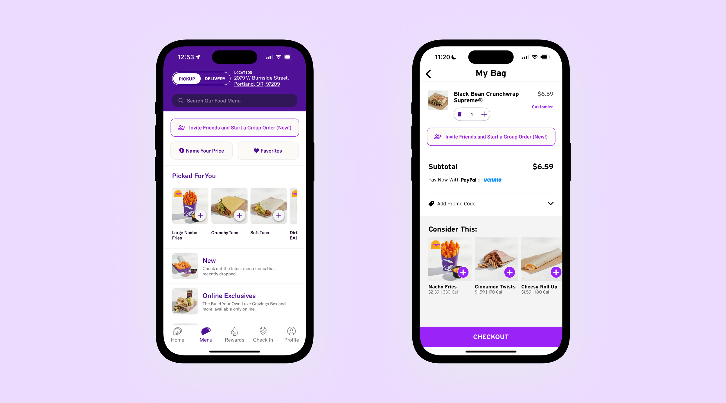
After receiving initial peer feedback, I created high-fidelity digital screens of the paper wireframes, following the Taco Bell UI and branding as closely as possible.
High-fidelity mobile screens: User 1 initiates a group
High-fidelity mobile screens: User 2 receives invitation and places order
High-fidelity mobile screens: User 2 submits their order and User 1 completes transaction
05. TESTING
Methods
Five testers participated in the usability study. Testing was conducted online and asynchronously using the Maze platform, with the goal of evaluating the effectiveness of the current task flows for the Taco Bell mobile app’s new group ordering feature, including:
Inviting someone to a group order
Accepting an invitation to a group order
Completing the group order transaction
Results
100% Completion Rate
All five testers successfully completed the multi-step user flow of starting, adding to, and completing a group order
WHAT WORKED
Three users identified the flexibility for the person initiating the group order to choose between paying for the entire order or allowing participants to pay individually as a positive feature.
WHAT DIDN’T
The CTA button for inviting friends to a group order lacks sufficient visual prominence, which may reduce discoverability and could be more effective if made more prominent.
06. ITERATE
The location and design of the button to create a group order was the biggest concern in usability testing. I reconsidered the button color and hierarchy, designing three initial options:
Group ordering button placement and color was redesigned based on user feedback.
I chose Option 1 for the final design, and also implemented the new button design into the "My Bag" screen, allowing users to start a group order from that part of the flow:
07. CONCLUSION
This project focused on designing a simple, seamless way for multiple people to place a group order within the Taco Bell app. Through research and competitive analysis, I was surprised to find that true group ordering is not widely supported across competitors, revealing an opportunity for Taco Bell to differentiate its mobile experience. Usability testing further validated this opportunity, as several participants expressed a genuine desire for this feature to exist.
While the prototype was limited in interactivity due to the lack of access to Taco Bell’s design system, I prioritized creating screens that felt realistic and cohesive within the existing app. Working within these constraints pushed me to think more deliberately about user flows–an area I continue to develop as a UX designer. Because the product and visual language already existed, this project allowed me to focus deeply on flow clarity, decision points, and handoffs between users. Overall, the process strengthened my ability to design within established systems while centering collaboration, simplicity, and usability in a shared ordering experience.
MORE TO EXPLORE