Mobile First Redesign
A modern, mobile-first redesign of the Skate Oregon School website, improving usability and streamlining access to lesson information.
MY ROLE
UX/UI Designer
PROJECT DURATION
1.5 Months
00. THE PROBLEM
Skate Oregon School (skateoregonschool.com) is a small, independent roller skating studio based in Portland, Oregon. It offers lessons for all skill levels–from beginners to advanced skaters–as well as community events, workshops, and seasonal camps for both children and adults. As roller skating has seen a resurgence in Portland, Skate Oregon School plays an important role by lowering barriers to entry and fostering a welcoming, skill-building environment for skaters of all ages.
While the school’s mission and offerings are strong, its current website does not effectively reflect its value or meet user needs. Built on Squarespace, the site is text-heavy, visually cluttered, and poorly structured. Confusing information architecture and content hierarchy make it difficult for users to find key information or take action, such as signing up for a class. Although technically responsive, the site lacks core UX and design principles, resulting in a frustrating experience, particularly on mobile.
01. DISCOVERY
Existing Site Audit
While a competitive analysis of indirect competitors was conducted, the audit of Skate Oregon School’s existing website revealed the clearest opportunities for improvement. Evaluating the current site highlighted key usability, content, and structural issues that informed the direction of the redesign.
Desktop and mobile screenshots of Skate Oregon School’s original website.
Strengths:
Ability to book classes online
Transparent pricing
Only business in Portland dedicated to teaching beginners
Offers the Roll Right curriculum for brand new skaters
Site is hosted by Squarespace (so updates to the UI should be feasible to implement)
Weaknesses:
Dense text and a lack of applied information hierarchy principles make the site confusing to view and navigate
Some text information is provided via graphics/images that were (probably) created for social media posts
No Events calendar or list
User Interviews
I conducted interviews with five users who were interested in roller skating lessons for themselves or their children. The interviews were held over Zoom, recorded, and transcribed for research purposes. The research goals were to:
Understand how people interested in roller skating currently engage with the hobby, or what factors may be preventing them from getting started.
Identify key pain points and barriers to entry, both related to roller skating itself and to the digital tools and resources they use.
After the interview, each user was tasked with exploring the existing website for Skate Oregon School, with the goal of discovering users’ expectations for the website, including how it should be organized, information provided, and visual design.
Insights and Site Evaluation
Mobile-first preference: All five users preferred to browse sites like Skate Oregon School on mobile, indicating a strong need for a mobile-first redesign.
Barriers: The most significant barriers to entry identified by participants were cost, scheduling conflicts, and limited access to skate lessons in their local area.
Evaluation of original site: Overall, users expressed confusion and a general dislike of the current SOS website, with one user stating “It's just not set up user friendly” and another lamenting, “I think this is a really cool company, a really cool idea. To have something like this offered in the community is like such a great idea. It's just not being represented well with this website.”
User feedback of the original site centered around issues with the visuals/aesthetic (particualrly the home page), heavy text, and confusion around content and class offerings.
02. DEFINE
User Personas
Based on interview insights, two user personas were created: Benji, a new skater seeking lessons and community, and Kandance, a busy single mother looking for activities for her active son.
POV + HMW
Based on the user personas, the following point-of-view statements and how-might-we questions were developed to guide the ideation phase:
User Persona 1:
Beginner roller skaters need a clear, supportive entry point into the sport–one that builds confidence, outlines a simple learning path, and helps them feel welcomed from the start.
–––
How might we encourage beginners to get started with roller skating so they feel confident, supported, and safe?
User Persona 2:
Busy parents need safe, affordable, and enriching activities that keep their kids engaged, so they can feel confident that their children are having fun and are well cared for.
–––
How might we instill confidence in parents that signing their kids up for roller skating camp is a fun, safe, and enriching summer option?
03. IDEATE
The ideation phase included developing user flows, a sitemap, and low- and mid-fidelity wireframes.
User Flows
I created two primary user flows to inform the design and guide later usability testing. The first focused on a new skater finding and booking a beginner-level class, and the second focused on a parent finding and enrolling their child in a Kids’ Skate Camp.
Sitemapping and Low-Fidelity Wireframing
Low-fidelity wireframe sketches and sitemapping were developed simultaneously to explore the most effective information architecture and site structure. Because all users indicated a preference for mobile, the initial sketches followed a mobile-first approach.
Sitemap brainstorming
Wireframe sketches for mobile
Mid-Fidelity Wireframing
Mid-fidelity wireframes were then created in Figma and evaluated by peers and users for content, navigation, and layout. Tester feedback indicated the buttons were too small and inconsistently aligned. There was still some confusion around the order of beginner-level classes.
Mid-fidelity mobile wireframes designed in Figma
04. DESIGN
Branding
Skate Oregon School already had an established set of logos, but lacked clearly defined brand colors and fonts. To address this, I selected a mix of bold and simple typefaces and developed a minimal color palette derived from the yellow used in one of the logos, reinforcing a retro aesthetic. Minimal UI components were also created to support the development of the high-fidelity designs.
Branding and UI kit: Colors, fonts, and UI components
High-Fidelity Screens
Incorporating peer feedback from the mid-fidelity designs, I developed high-fidelity versions of the Home page and menu overlay, along with the Classes, Events, Pricing, and About Us pages. I also designed second-level pages for the Roll Right program and Kids’ Skate Camps.
High-fidelity mobile screens
Using a progressive enhancement approach, I designed desktop versions of four key screens: the Home page, Classes, and Roll Right.
High-fidelity desktop screens
05. TESTING
Methods
The same five users who evaluated the original site also participated in the usability test of the redesign. They were not asked to complete specific tasks, but rather to evaluate the changes made. Testing was conducted online and asynchronously using the Maze platform.
The goals of testing were to evaluate the effectiveness of the proposed website redesign for Skate Oregon School, including:
Improvements to the overall layout, readability, and flow
Updated information architecture to better serve user needs and expectations
Enhanced visual hierarchy and alignment with established UX/UI design principles
Results
Overall feedback was highly positive, with users highlighting the design as user-friendly, clean, and easy to navigate:
“The content is clear. I can find the booking easily. The photos are fun and look engaging. It felt user-friendly.”
“Clean, user-friendly and easy to understand.”
“I like the graphics used, and the colors give it a nostalgic vibe. Font is easy to read.”
“Looks a gazillion times better than the previous site.”
Some participants were still unclear about business hours and the timing of specific offerings, such as open skate and practice sessions:
“The content seems pretty clear. I’m not sure of the hours, though?”
“I am still confused about the hours though and when ‘open skate’ or practice time is.”
06. ITERATE
The initial prototype did not include business hours, as all classes, lessons, and practice time must be booked in advance and drop-ins are not permitted. However, testers found the absence of hours confusing, with one participant describing it as off-putting. A parent also noted that listing hours in the footer makes them easier to find. In response, I added business hours to the footer with a disclaimer indicating that the business operates by appointment only, and would also recommend including this information on the FAQ page.
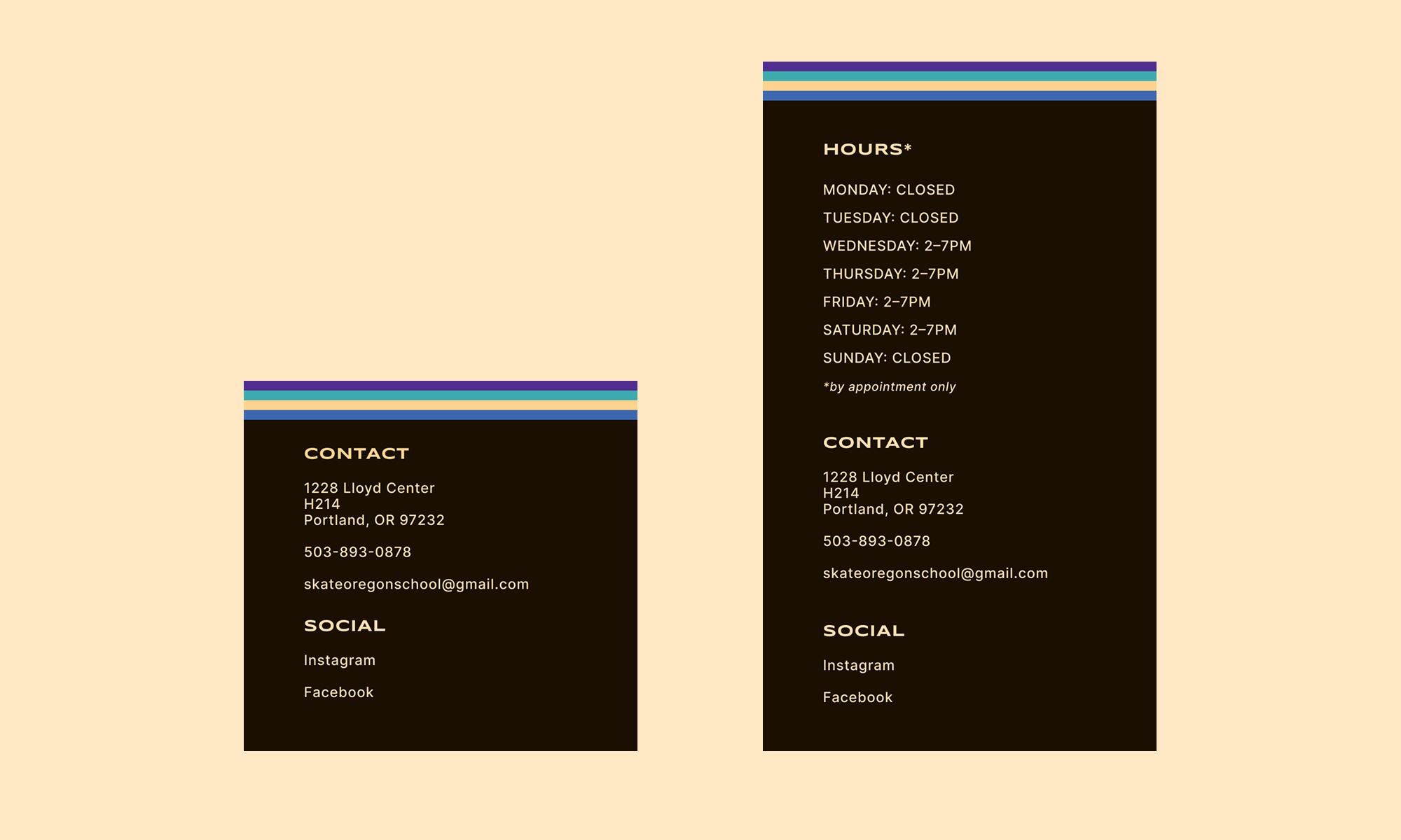
Iteration 1: Original footer and updated footer with hours listed
One tester observed that there was no mention of the practice time hours or a way to book practice time from the prototype. I added the Practice Time card to the Classes page and slightly restructured the categories – Intermediate became Intermediate + Other – as a way to include practice time and private lessons, another offering that had been unintentionally omitted.
Iteration 2: Addition of Practice Time and Private Lesson cards under “Intermediate + Other”
07. CONCLUSION
This project reinforced the importance of establishing and documenting core UI components early in the design process. Because templates and components were not fully locked down at the outset, later iterations required unnecessary, time-consuming adjustments across multiple pages. I also gained valuable experience balancing information architecture and visual design. Given that the primary purpose of the site is to help users quickly find information, I focused on creating a clear, well-organized structure and a clean, simple interface, while incorporating a subtle retro aesthetic to reflect the culture of roller skating. Finally, usability testing validated that the design decisions aligned with user needs and goals. Involving the same participants from the initial research in usability testing allowed for direct comparison between the original site and the redesign, and feedback was overwhelmingly positive. Engaging both skaters and parents highlighted overlapping but distinct needs, underscoring the importance of designing for multiple core user groups.
MORE TO EXPLORE